
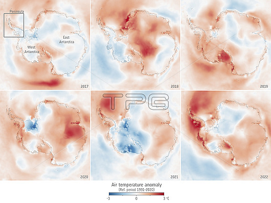
Antarctica air temperature anomalies. These maps show average air temperatures from 2017 (top left) to 2022 (bottom right) over the Antarctic compared to the 1991-2020 average. Blue areas are colder than average, while pink and red areas are warmer than average.
| px | px | dpi | = | cm | x | cm | = | MB |
Details
Creative#:
TOP28948670
Source:
達志影像
Authorization Type:
RM
Release Information:
須由TPG 完整授權
Model Release:
n/a
Property Release:
n/a
Right to Privacy:
No
Same folder images:
Restriction:
This image may not be used to state or imply ESA endorsement of any company or product
 Loading