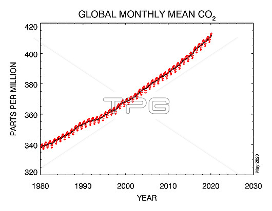
Graph showing global-averaged monthly mean atmospheric carbon dioxide (CO2) levels as determined from marine surface sites since 1980. The levels are given in parts per billion. Levels of carbon dioxide have risen due to the combustion of fossil fuels and deforestation. The dashed red line with diamond symbols represents the monthly mean values, centered on the middle of each month. The black line with the square symbols represents the same, after correction for the average seasonal cycle.
| px | px | dpi | = | cm | x | cm | = | MB |
Details
Creative#:
TOP25746970
Source:
達志影像
Authorization Type:
RM
Release Information:
須由TPG 完整授權
Model Release:
N/A
Property Release:
N/A
Right to Privacy:
No
Same folder images:
2000s2010s21stcenturyartworkatmosphereatmosphericaveragechartclimatechangeclimatologicalclimatologydryairmolefractionearthscienceenvironmentenvironmentalsciencegasgeographicalgeographyglobalglobalwarminggraphgraphicgreenhousegasillustrationincreaseincreasingmeanmeasurementmonthlyno-onenobodyrisingcarbondioxideco2whitebackground20thcentury1980s1990s1900s
1900s1980s1990s2000s2010s20th21stairartworkatmosphereatmosphericaveragebackgroundcarboncenturycenturychangechartclimateclimatologicalclimatologyco2dioxidedryearthenvironmentenvironmentalfractiongasgasgeographicalgeographyglobalglobalgraphgraphicgreenhouseillustrationincreaseincreasingmeanmeasurementmolemonthlyno-onenobodyrisingsciencesciencewarmingwhite

 Loading