
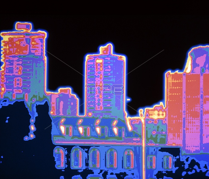
Heat loss. Thermogram showing the distribution of heat over city buildings. The colour coding ranges from yellow and red for the warmest areas (greatest heat loss) through pink to purple and green for the coolest areas (lowest heat loss). Typically roofs and windows show greatest heat loss. Thermograms are often used to check buildings for heat loss, so that they can be made more energy efficient through improved insulation.
| px | px | dpi | = | cm | x | cm | = | MB |
Details
Creative#:
TOP10193965
Source:
達志影像
Authorization Type:
RM
Release Information:
須由TPG 完整授權
Model Release:
N/A
Property Release:
N/A
Right to Privacy:
No
Same folder images:
 Loading